I took what I did in my last experimentation 'I AM PHOTOGRAPHY', using an image for each letter and inverting the inside of the text and decided that instead of just editing it digitally, I would actually print out each image and cut into the inside of the letter.

This gave me the idea to print them all out in an A5 size, turn them over, and draw on each letter.
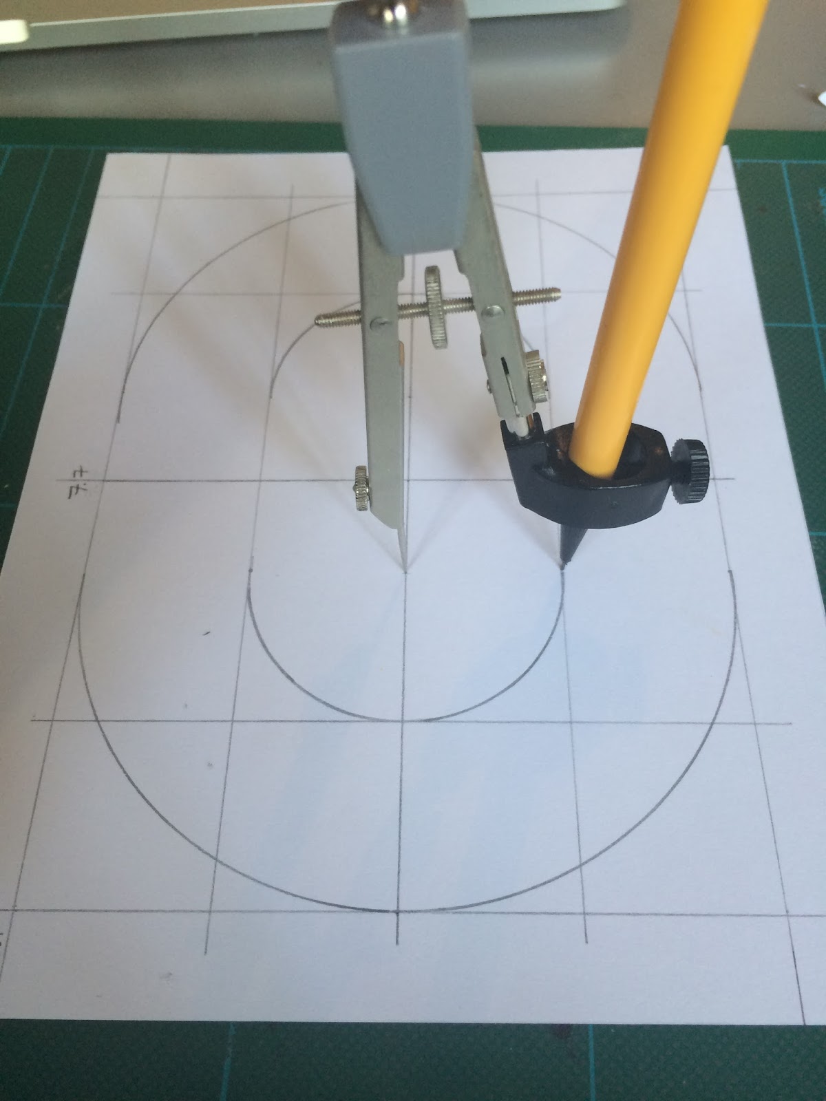
I started by deciding a standard border size of 1.5cm then by trial and error, drew on a standard bold style typeface. I didn't observe a typeface whilst doing this, I just used what I knew about typeface design and put it into practice.

I measured out the centre on each A5 sheet and drew a graph style cross through the middle to use as reference points.

I then used my compass and measured from the centre along the x-axis (horizontal) with my compass and stretched it out to match. I then put the point of the compass at the top and measured down the y-axis to where I needed to put the point and drew the semi-circle.


I repeated this at the other end to make an oval sort of shape.

I then used the width of the ruler to make the thickness of the letter, this was a lot easier than actually measuring it out every time. I drew around the inside of the border line to create new boundaries for the inside semi-circle.

I repeated the process from the larger semi-circle to draw the inside oval.


Now I had the shape of my 'O' so I went around and rubbed out most of my guidelines and defined the edges of the 'O'.

I then rubbed off all of the inside guidelines and neatened up the edges still leaving the cross in the middle just in case I rubbed out a line by accident and needed to redraw it.

As it got later and later into the night, I forgot that all of the letters that weren't mirrorable had to be drawn backwards. I finished all of the letters thinking it was all done and went to bed. When I woke the next morning and went back to my work, I realised my mistake and had to flip over all of the letters I had done wrong, this was 5 letters and an extra hour of work.
After doing all of my letters correctly, I started coming up with ideas about what I could cut into the centre. I thought that seems as all of the images are of nature, I would cut in leaves and vines.
I did the 'I' with leaves in the corner and realised it didn't actually look that good so I scrapped that idea and went ahead with just the vines.


After 5 days of non-stop working on these photos, I am finally finished. After finishing I realised I needed to find something to stick the photos up on that would really show off the work I had done and what better than the window? The beautiful trees outside match my nature theme.


No comments:
Post a Comment